
My themes and ideas.
THE HISTORY OF PHOTOBOOKS.
A phonebook is a book of chosen photographs that have an theme or follows a storyline in a reasonable cheap way of assembling the work of the photographer and making it accessible to a mass audience.
Early photobooks were used to illustrate the work of individual photographers or a new type of photographic process. Over, the years, they have helped to establish that a sequence of images represents a narrative through a themed sequence of images. Today photobooks are crucial for financing and circulating modern photography enabling enthusiasts access to a wide range of photographers from across the world.
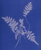
in around 1843, botanist Anna Atkins created the worlds first photobook by pressing her botanic specimens onto light sensitive paper to create images. By the end of the year she self published her gatherings of botanic pressing in the photobook titles "Photographs of British Algae: Cyanotype Impressions.
Early photobooks were used to illustrate the work of individual photographers or a new type of photographic process. Over, the years, they have helped to establish that a sequence of images represents a narrative through a themed sequence of images. Today photobooks are crucial for financing and circulating modern photography enabling enthusiasts access to a wide range of photographers from across the world.
in around 1843, botanist Anna Atkins created the worlds first photobook by pressing her botanic specimens onto light sensitive paper to create images. By the end of the year she self published her gatherings of botanic pressing in the photobook titles "Photographs of British Algae: Cyanotype Impressions.
PAUL GRAHAM
|
|
I enjoy Paul Grahams use of placement throughout his photobook with images varying between overlapping other pages and placed on full spreads or in one corner,
I also enjoy his use of colouring in the photos which act like a hue filter. |


aida
andrew youngson
Subject Matter:
- What is this book about? The book as about empty space as explained at the beginning of the book giving a translation of the word "Aida" (space).
- Subject? Spacing in-between 2 houses taken in Japan.
- The cover is made from a natural, seemingly recycled cardboard like material with a the Chinese character "The Japanese kanji ‘間’, which has multiple phonetic readings and meanings. The kanji is placed in the centre with a lot of space surrounding it which refers to the meaning of the simple being empty space.
- The photos are plain and simple, but the subject of something no one ever pays attention to.
- the gap and spacing between Japanese housing communicate the photographer’s intention of empty space suggesting the unused and unimportant space.
- The portrait photos often capture the full height of the housing with the gap, capturing more of the empty space.
- There seems to be a grey theme/aesthetic with concrete housing and roofing.
- Every so often there are 2 images placed on an entire page and other times there is only 1. there doesn't seem to be any correlation between why these are placed in this non repetitive order. The photos seemed to be placed next to each other in photographed order of either side of the house between another house. The photos are placed simply to fit the page with a medium sized white boarder around it.
- There is no text or explanation on any of the photos, as the photos are pretty self explanatory.
- between the cover and the first page there is a thing page of tissue like brown paper, which aesthetically related to the colours in the first image. After the first image the next page contains the same character and writing to the front cover, then comes the only text in the book placed in the centre of the page.
- the type face includes serif, and is thin and delicate allowing a lot of space around the lettering
- each photograph looks faded which creates an old, softer look to the photographs.
- the book is recognisable as it is so diverse and such as simple concept yet no one seems to notice these everyday aspects.
- The book is interesting as it gives an insight of differencing and space between 2 separate lives.
- as the photographs take up the whole page, the a5 sized book seems to be a perfect size as the images resided to be able to view all in one and not too large.
|
|
|
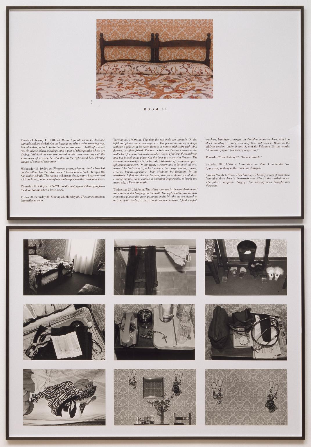
sophie calle hotel
The Hotel, Room 471981
|
On Monday, February 16, 1981, Sophie Calle was hired as a temporary chambermaid for three weeks in a Venetian hotel. She was assigned twelve bedrooms on the fourth floor for cleaning duties which during her time examined and observed the personal belongings of the hotel guests, invading personal and hidden lives.
|
Davey moyra


“The coffee shop, the library.” is an exhibition in a series of gridded works featuring analog photographs of everyday objects individuated by the accumulation of human touch overlooked in daily life: coins, kitchen shelves, and clumps of dust gathered along the floor. These photographs where taken at MoMA, at the public library, and in cafés—with iconic coffee shop images by Bruce Davidson and Saul Leiter.
Davey folded these images like envelopes which were mailed to friends, then shown complete with stamps, postmarks, and return addresses.
Davey folded these images like envelopes which were mailed to friends, then shown complete with stamps, postmarks, and return addresses.


I used a Panasonic TZ70 camera to create these photos around my house, finding very mundane objects which I photographed with a flash. I decided this camera was more suited than my cannon as it captured more grainier images like Moyras.
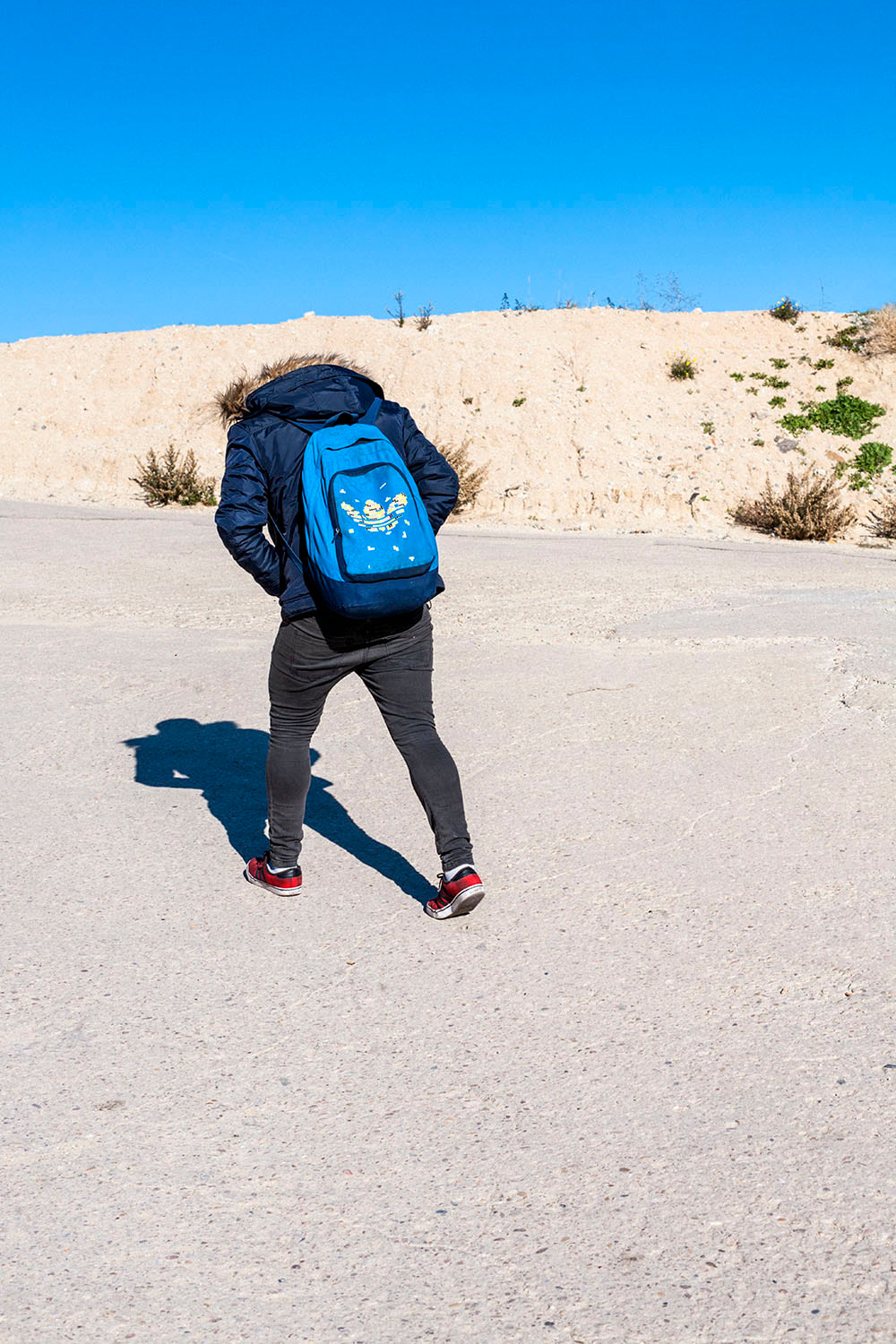
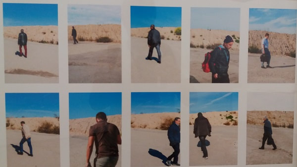
David Hornillos - Ustedes, los vivos
His phonebook consists of similar images taken in the same location throughout the day. the images captures individual people that cross the path infant, capturing their character.
|
The plain location subjectifies who ever crosses it, bringing great attention to details such as their styles and how it reflects their character. Some are unidentifiable as their faces are not visible, making us rely on their clothing and their posture to assume their personality.
|
|
Idea of abandoned or forgotten.
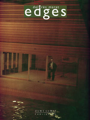
Dolorès marat EDGES
|
Her photographs range from subjects of blurred singular people to abandoned and forgotten locations or objects. the dull lit features reinforce the forgotten and lonely aspects. the images are rather simplistic, with singular subjects which reinforces that they are alone and forgotten. hardly any text, simple titles describing exactly what is in the image.
|


DOLORÈS MARAT EDGES
grain...
Explain today's task and using a photographer you have researched for your photobook, choose an image and answer the following questions:
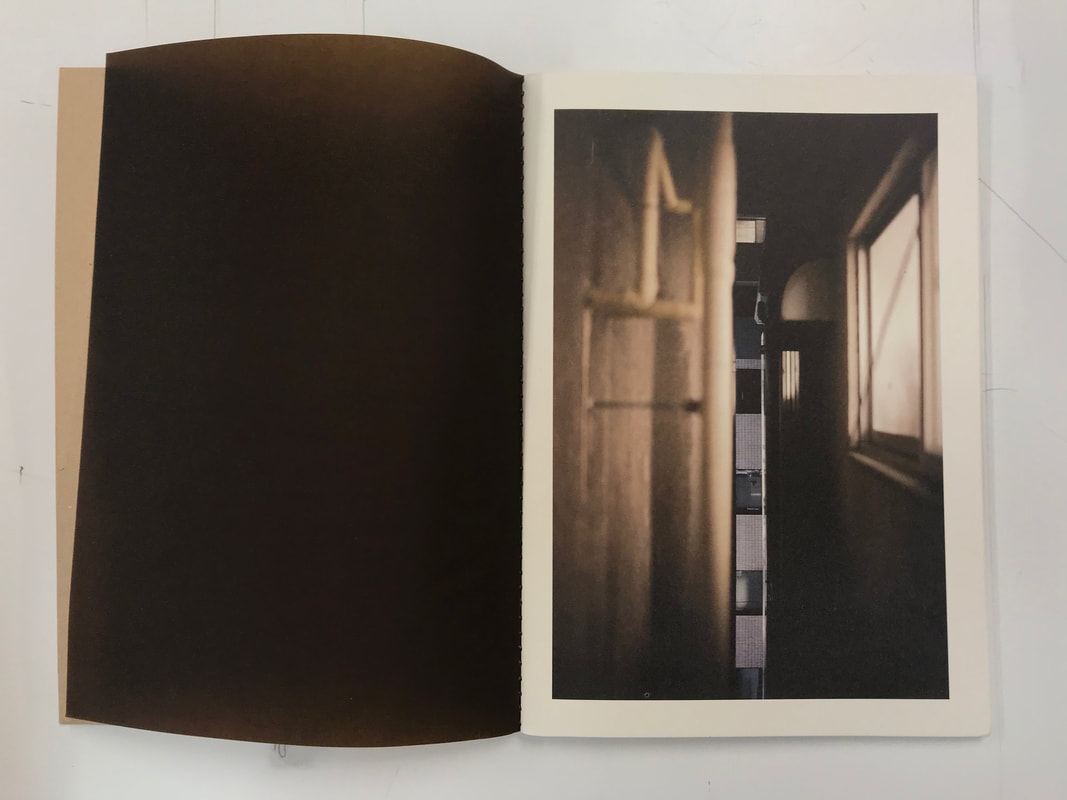
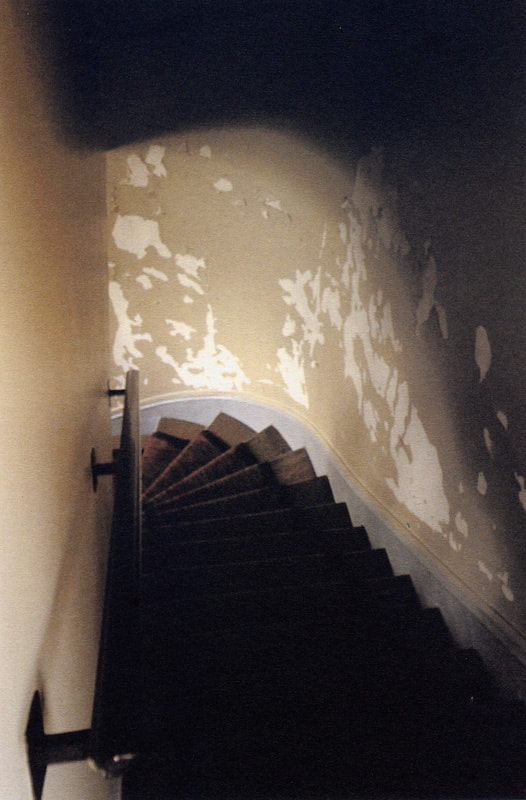
The main subject of this photograph is a descending spiral stairwell with old, peeling wallpaper.
The image could have been taken at any time however the style of the carpet and old wall suggests the image is rather old. The spacing in the staircase is very narrow which Bonafoux captures through guiding lines in the image of the banister and the curved wall.
What words would you use to describe this photograph?
This photograph is rather mysterious but in an unusual way, as a typical image of a descending staircase would be dark at the bottom rather than at the top however this image challenges this. Specific words to describe this image would be: Dull, Dark, Spiral, Descending, Old, Grainy.
What title would you give to this photograph? Old Spiral Staircase
What made you decide on that title?As mARATS titles are usually very simplistic and primarily describe the exact subject of the image so therefore I titled the image exactly how it is.
How would you describe this photograph to a person who could not see it? A dull lit, Old fashioned spiral stair case with peeling wallpaper and natural lighting at the bottom left.
Why do you suppose the artist made this photograph? What makes you think that? Because of the unusual lighting where the top where the image is taken is rather dark and the bottom is well light however mysterious as it is unseen.
How has the photographer captured the play of light in this image? There is a gradient of dark to light.
What do you think is effective about this photograph? What doesn’t work so well? The spiral stair well acts as a guidance to where we should look.
What do you think other people would say about this work? Why do you think that? I think other people would describe the picture as mysterious.
How is this picture different from real life? In real life, it wouldn't be grainy and the dark areas would probably be more visible.
Which part of the photograph strikes you as most interesting - captivating, surprising, puzzling, mysterious? Why? The ripped wallpaper on only one side of the wall, and how it happened.
grain...
Explain today's task and using a photographer you have researched for your photobook, choose an image and answer the following questions:
The main subject of this photograph is a descending spiral stairwell with old, peeling wallpaper.
The image could have been taken at any time however the style of the carpet and old wall suggests the image is rather old. The spacing in the staircase is very narrow which Bonafoux captures through guiding lines in the image of the banister and the curved wall.
What words would you use to describe this photograph?
This photograph is rather mysterious but in an unusual way, as a typical image of a descending staircase would be dark at the bottom rather than at the top however this image challenges this. Specific words to describe this image would be: Dull, Dark, Spiral, Descending, Old, Grainy.
What title would you give to this photograph? Old Spiral Staircase
What made you decide on that title?As mARATS titles are usually very simplistic and primarily describe the exact subject of the image so therefore I titled the image exactly how it is.
How would you describe this photograph to a person who could not see it? A dull lit, Old fashioned spiral stair case with peeling wallpaper and natural lighting at the bottom left.
Why do you suppose the artist made this photograph? What makes you think that? Because of the unusual lighting where the top where the image is taken is rather dark and the bottom is well light however mysterious as it is unseen.
How has the photographer captured the play of light in this image? There is a gradient of dark to light.
What do you think is effective about this photograph? What doesn’t work so well? The spiral stair well acts as a guidance to where we should look.
What do you think other people would say about this work? Why do you think that? I think other people would describe the picture as mysterious.
How is this picture different from real life? In real life, it wouldn't be grainy and the dark areas would probably be more visible.
Which part of the photograph strikes you as most interesting - captivating, surprising, puzzling, mysterious? Why? The ripped wallpaper on only one side of the wall, and how it happened.
Bastartd countryside- robin friend
|
|
Similar to pascal bonafoux text with forgotten places and objects, however these photos are entirely in focus and rather colourful with bright lighting. aspects of vacant and forgotten.
|


DAVIS AYER
|
Davis Ayers
Dvis Ayers favourite format to photograph on is the Fujifilm Fp-100C Peel-Apart Instant Film polaroid. Ayer would created corroded images by peeling apart the Fuji 100C, and then poured bleach onto the black backing of the negative side to dissolve it, then would wipe it off, adding layered textures and, effectively, turning it into a big negative. Other processes he enjoys doing is loosening the emulsion on his developed negatives to make the images bleed away, or experimenting with diluted chemicals, paint, food coloring, and—more recently—fabric. Ayres photo album "specimens" features flattened almost photocopied like, plants and flowers with a cool colour chain of purple, blues and greens. Other photo albums " symbiosis" include layered images featuring often naked women, with a floral layered image. He also experiments with projections of landscapes or floral patterns onto body parts with black backgrounds, isolating the image onto the model. There are certain aesthetics that he believes he picked up in his studies that inspired his photographs such as—Japanese architecture, minimalism and use of negative space as positive space and believes in a natural mood with the portraiture, allowing people be who they where. He looked up to photographers like Steven Shore, Joel Sternfeld and Andreas Gursky. With Gursky, Ayer was intrigued by the art of patterns and places where order is found within chaos. Ayer prefers film cameras over DSLR as he finds them unsatisfying simple because there's "so much perfection." For him, it’s the imperfections and the moments you couldn’t really capture digitally. MY RESPONSES.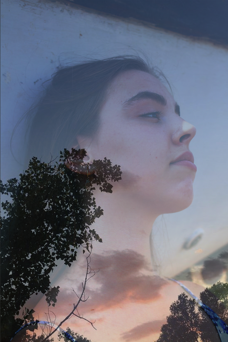
|


Chung seekee
|
Chung Seekees images have aspects of almost dream like, blurred or eerie atmospheres. She creates 3-D windows in a rectangular frame covered with frosted glass where she places cut out fragments of images behind creating shrouded depth ors sometimes natural forms of trees or plants. These interiors are often illuminated from behind with a subtle light.
|
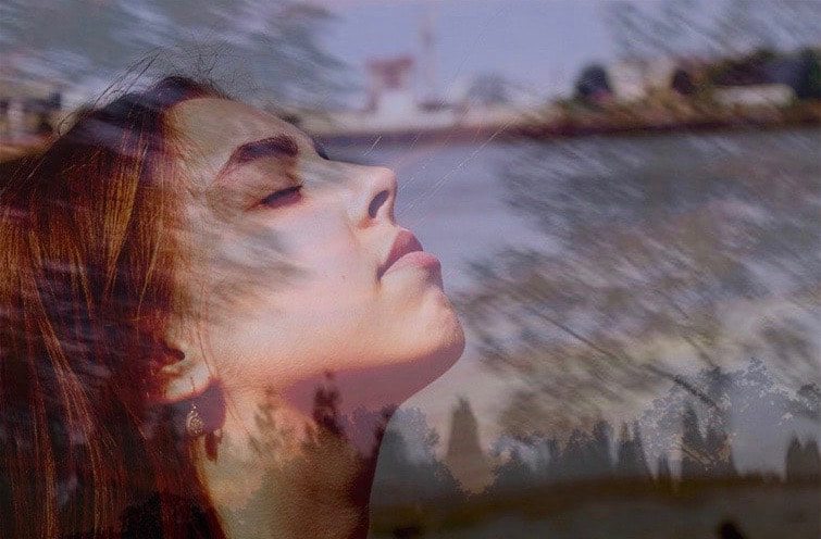
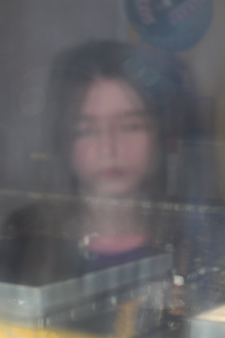
Inspired idea.The blurriness in Chung Seekees work made me think of blindness or lack of sight, I thought this would be an interesting concept to try to photograph, different types of blinds to recreate how others perceive the word from their eyes.
|


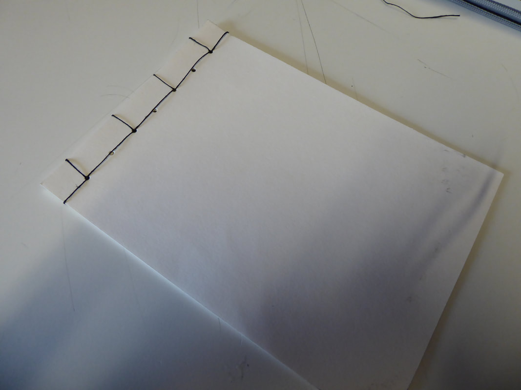
Binding photobooks.
Japanese binding.


|
the first stage is to accumulate all the needed tools, such as a Japanese screw punch, paper cut to the same size and string about 5 times the length of the card.
|
Then, I folded a piece of thinner paper 3 times and drew a boarder of 1 inch. I placed it ontop of the card and held it in place with a small clamp clip on the opposite side.
|
Using the Japanese screw punch I poked holes in each point where the folds met the boarder.
|


|
I started with threading the string through the 3rd hole, halfway through the pages, leaving a small strand inside the book. I threaded the string around the corner, and continued to thread it through to the 5th hole.
|
Once I had returned to the 3rd hole where I started, I tied the rest of the thread to the thread left at the beginning.
|
To ensure the binding is eye pleasing, the string would have to be pulled tight to ensure it is not loose.
|
My photobook


evaluation.
My images related through aesthetics which I thought would be better presented in a foldable poster zine instead of a book so they could all be seen at once. I believed the sequence worked well as each four squared images contained similarities in colour and occasionally subjects .
i preferred the Matt sugar Paper to the plain white paper however because many of the images were rather dark they were hard to see, I should have increased the brightness to make them clearer.
i would have liked the images to correlate to one another with other similarities other than pleasing appearance, however because I struggled planning the theme, the pictures were taken from pure randomness without much aim to produce correlating images. There were others I would have liked to include however they did not fit the aesthetic and I didn’t want to corrupt the order.
my first 4 image spread page took inspiration from photographer Chung Seeker
2nd page taking inspiration from photographer Pascal Bonagoux, focusing on colours and full lit, lonely objects.
the front and back cover page images were taken from my response to Davey Moyras work of daily objects using a digital camera and a flash to capture the spotlide features of her photographers.
the layout of the book was greatly influenced by Davey Moyras folded grid pictures.
I believe the large image on the back wasn't an impressive image to have on such a large scale. I believe instead, I could have used a photograph inspired by Davis Ayer, as I didn't include any of my inspired work in the photobook which relate to the idea of melancholy.
